Timeline:
1 week, February 2024
Tools:
Figma
Project type:
Freelance work
Limitations:
-Short turnaround meant no time for research
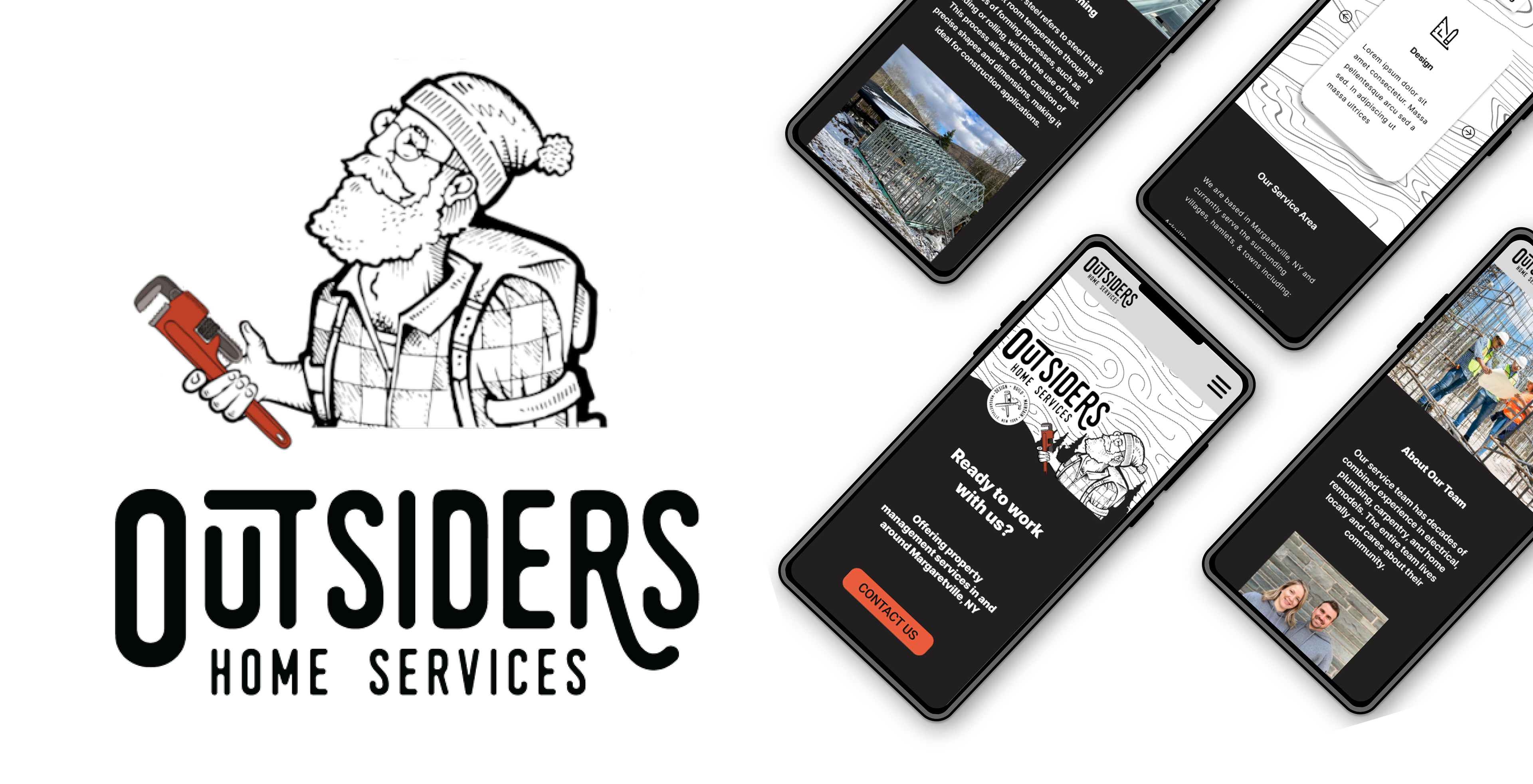
Brief: I was given the task of revamping the existing website of the construction company, Outsiders Construction, for a developer to later code.
Goals: The goal was to identify pain points within the existing design to create a more intuitive site for potential clients, as well as make a prototype with annotations for a developer to use during coding.
Previous design:

Pain Points:
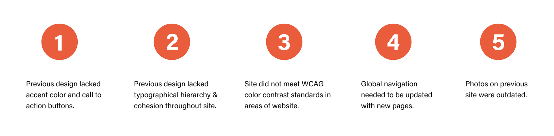
1. Previous design had a muted color palette and no call to action buttons. Color scheme was a mix of greys and blacks, and did not create focal points for users to contact the company, nor to get quick access to basic information about the company. Users were only prompted to contact the business if they scrolled down to the footer.
2. Previous design lacked typographical hierarchy and cohesion. Multiple typefaces that would be indistinguishable to the average user. Both typefaces and hierarchy did not separate information into bite sized chunks.
3. Site did not meet WCAG color contrast standards. While some of the site did meet WCAG color contrast standards, areas where the previous topographical background were were too close in color to pass contrast standards
4. Global navigation needed to be updated with new pages, adding pages to showcase their residential and commercial work as well as a page for information on their new investment in a steel framing machine.
5. Many of the photos on the previous site were outdated and featured crew members that no longer worked for the company.
Final outcome:
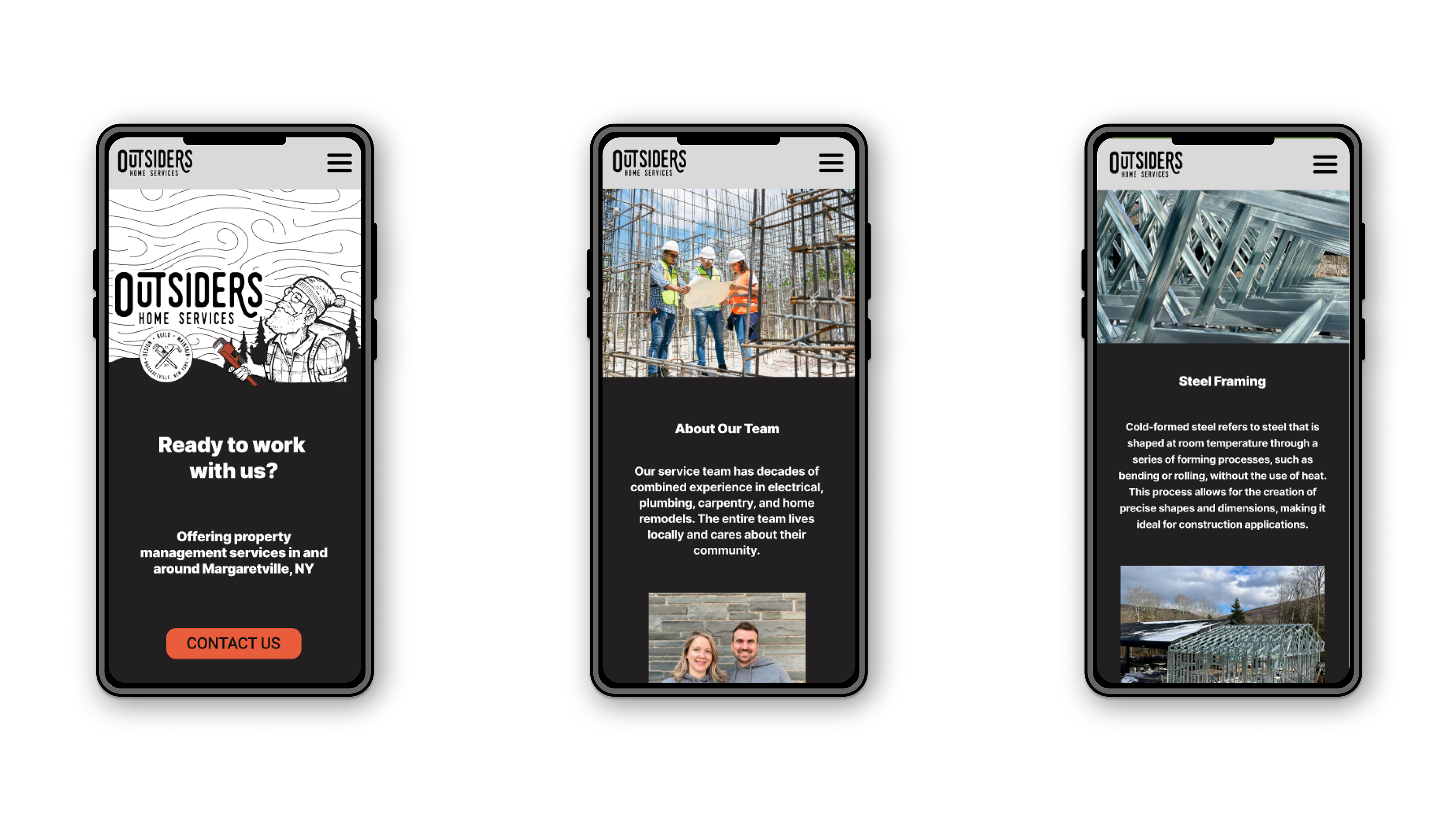

Website Updates
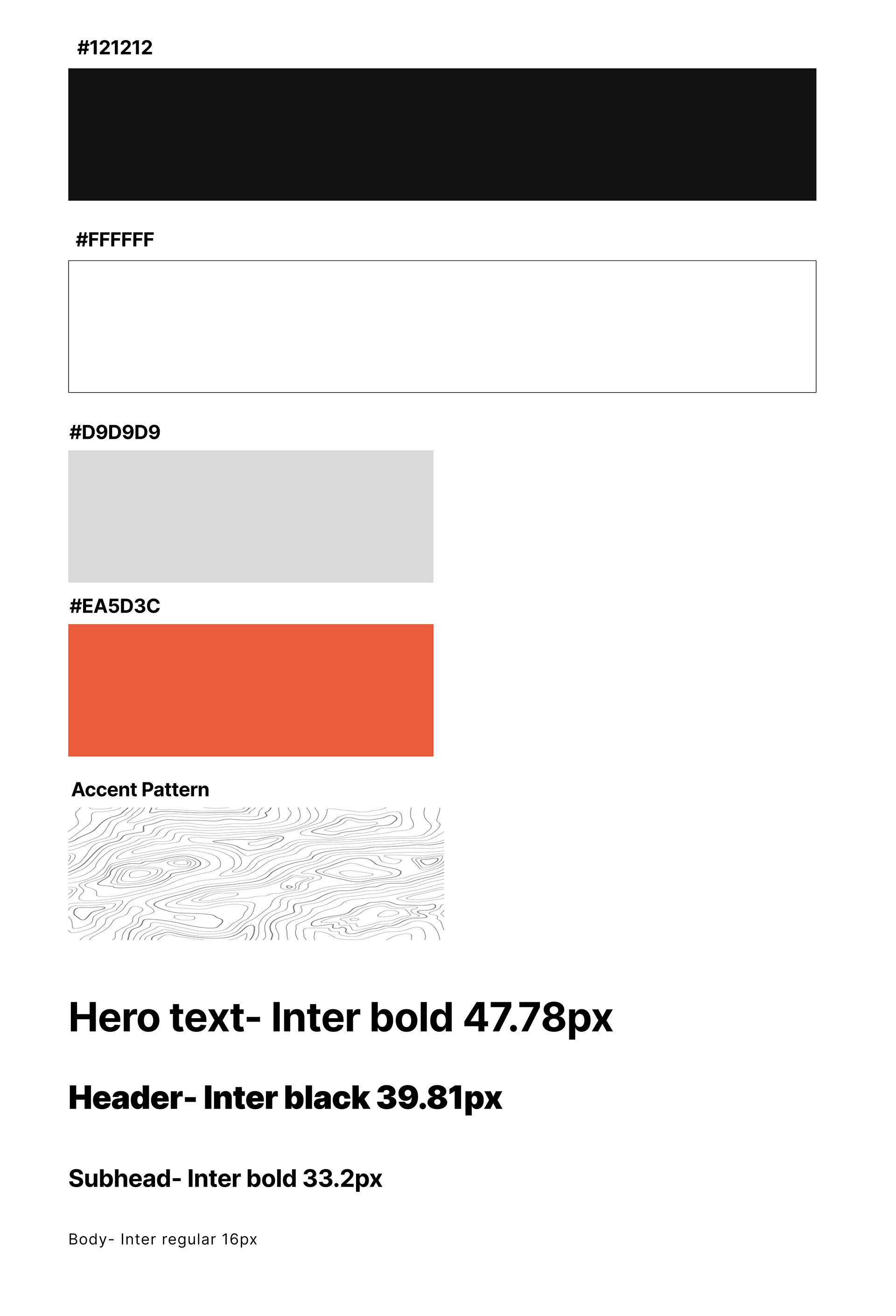
1. Accent color & Call to Action buttons added. Call to action buttons were added to global navigation and to home page, above the fold, so potential customers had easy access to contacting the company. Orange accent color was added to draw attention to call to action buttons, which matches wrench in existing company logo.
2. Website typography streamlined. All type hierarchy was streamlined and based on minor third type scale. Font changed to google's inter to create clean and dynamic look for the website.
3. Website brought up to WCAG color contrast standards. All type brought to AA color contrast standards, including the new accent color. Type on patterned background has white background in order to make type as accessible as possible.
4. Global navigation updated. Clients wanted to remove existing pages and replace them with new content, including two pages showcasing their work portfolio, as well as a page dedicated to new steel framing equipment they had acquired.
Website link: Coming Soon! Currently being developed
Reflections
Ideally, I would have loved to conduct any research for this project, but the time frame did not allow. If clients wants updates or changes in the future, I would suggest some sort of research such as first click testing or moderated site navigation to check how the site can be improved.