Timeline:
11 weeks, August-October 2023
Tools:
Figma, FigJam
Project type:
Bootcamp project
Limitations:
-Only market research
Brief: I was given the task of creating an food & grocery delivery app to cater to users who prefer high-end dining & groceries.
Problem: People with dietary restrictions or allergies need a tool to help them find groceries and restaurant food that meets their food needs in order to them to be able to efficiently and safely enjoy their food, all while having access to high-end restaurants and quality ingredients from premium suppliers.
Goals: The goal was to identify a niche market for a grocery & restaurant delivery app. First market research was conducted to find opportunities in the market, then a brand identity could be created, such as logo, brand colors, and typefaces. Afterwards, frames and prototypes could be created including a marketing landing page, 404 error page, onboarding sequence, and a high-fidelity prototype.
Research:
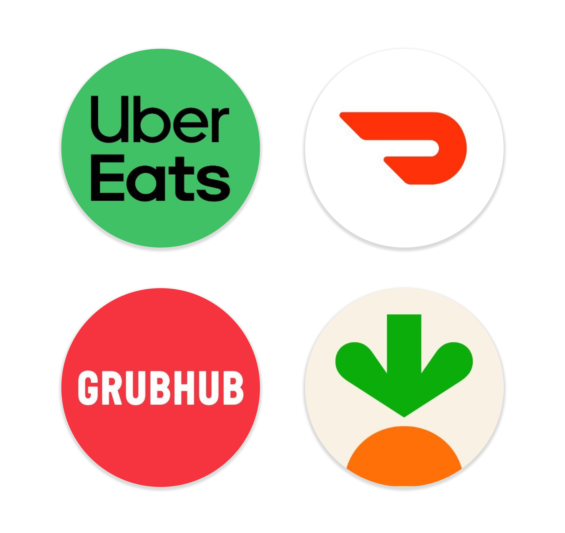
Competitive Analysis
A competitive analysis was conducted on existing grocery or food delivery apps in order to evaluate:
-various fees related to the app
-in-app features for those with allergies or food restrictions
-average delivery times
-environmental practices to offset carbon footprint of delivery companies
-availability of both grocery and food delivery for one app
Competitive analysis pain points
Competitive analysis results showed three major opportunities for EatsEase:
1. Competitor's were all very similar. Although they are all successful apps in their own right, they all lacked distinct features or target audience. Because of this EatsEase could benefit from showcasing different features and honing in on a more niche audience.
2. Competitors lacked consistent allergen features for users in their apps. Uber Eats allows users to app allergy filters to accounts but restaurants are not obligated to add allergens to their listed items. This creates inconsistent listings of major allergens, which can be dangerous for users with allergies.
3. Competitors lacked access to high-end restaurant delivery and access to quality or exotic ingredients from premium suppliers. Competitors have access to some high-end restaurants and providers, but EatsEase could benefit from tapping into that niche market.
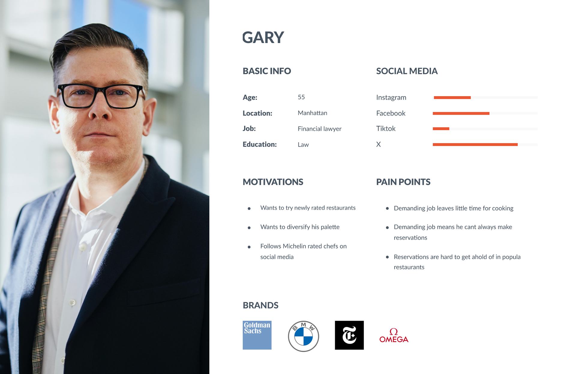
User Persona
A user persona was created in order to identify possible pain points for users, based on previous research. The user persona reads as follows:
"Gary, who lives in Manhattan, is a financial lawyer and a self proclaimed foodie. He religiously reads the yearly New York Times 'Top 100 Restaurants in NYC' and wants to try out restaurants that have made the list. Because of his demanding job as a lawyer he struggles to find the time to cook for himself, let alone make strict reservations for extremely popular restaurants."
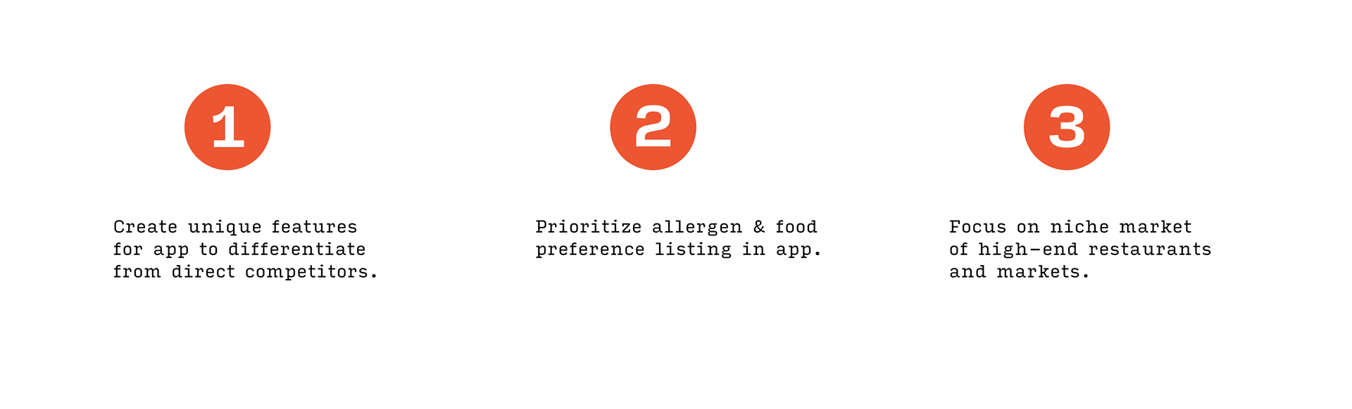
Game plan for prototypes
Based off the research and pain points, I thought the app should move forward with the following features:
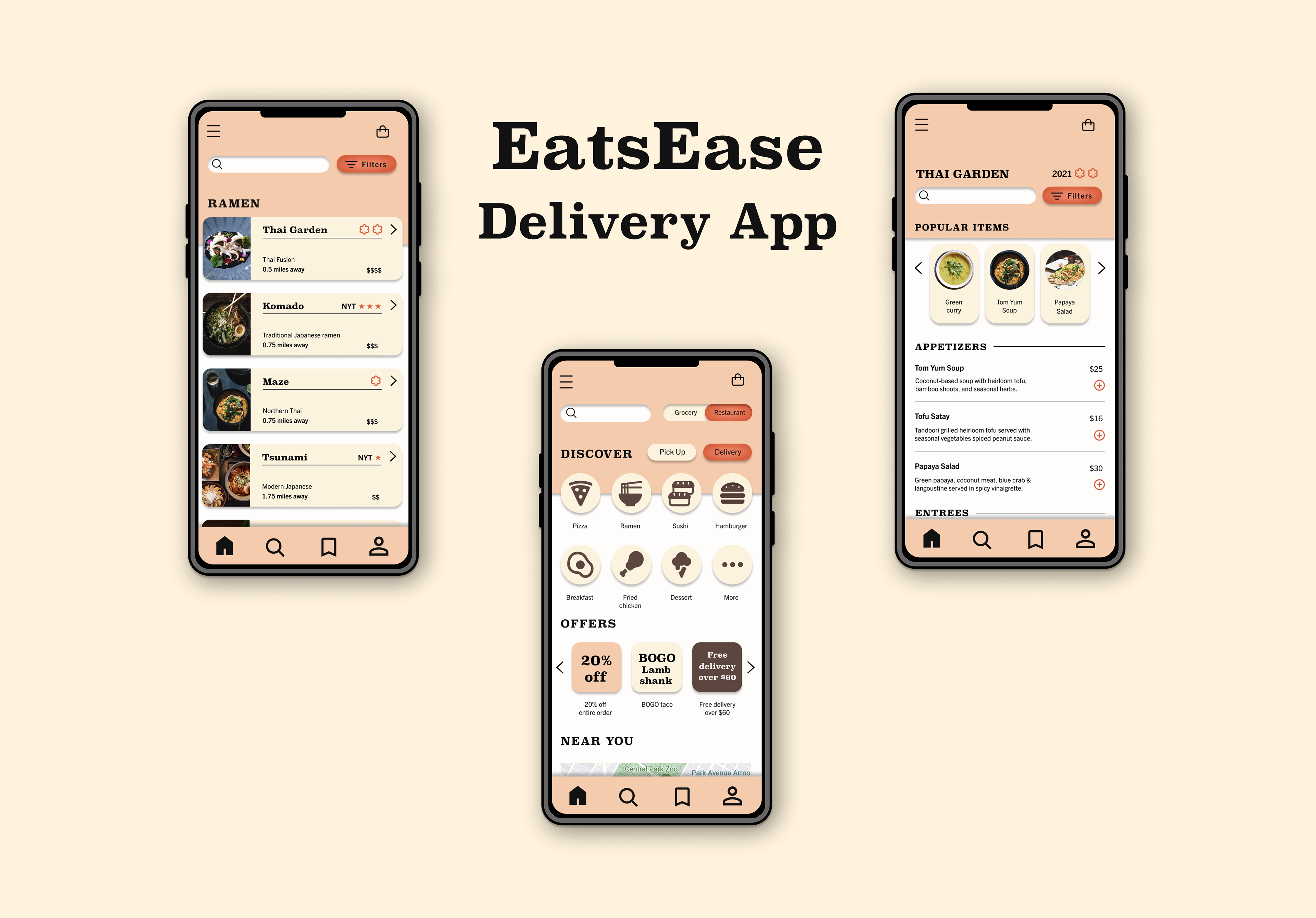
Mid-fidelity Wireframes
Onboarding
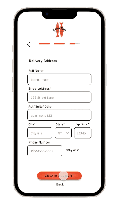
Mid-fidelity onboarding wireframes were created, with a sign up form for users to fill out. The form included the user's account information, payment information, and delivery address. Once the form was filled out, users are met with a confirmation screen to signify users successfully created an account.
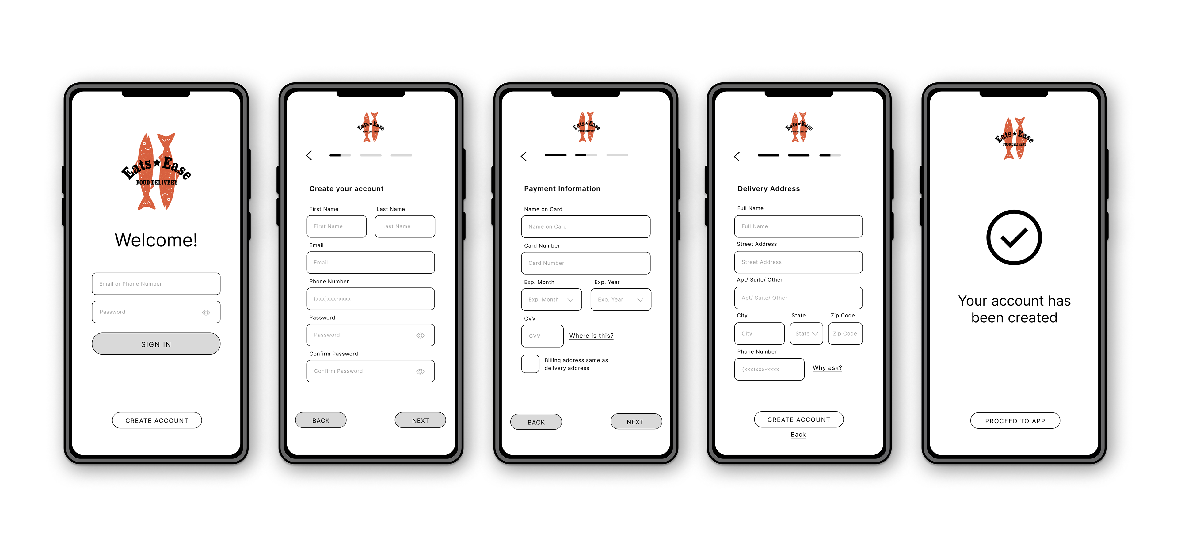
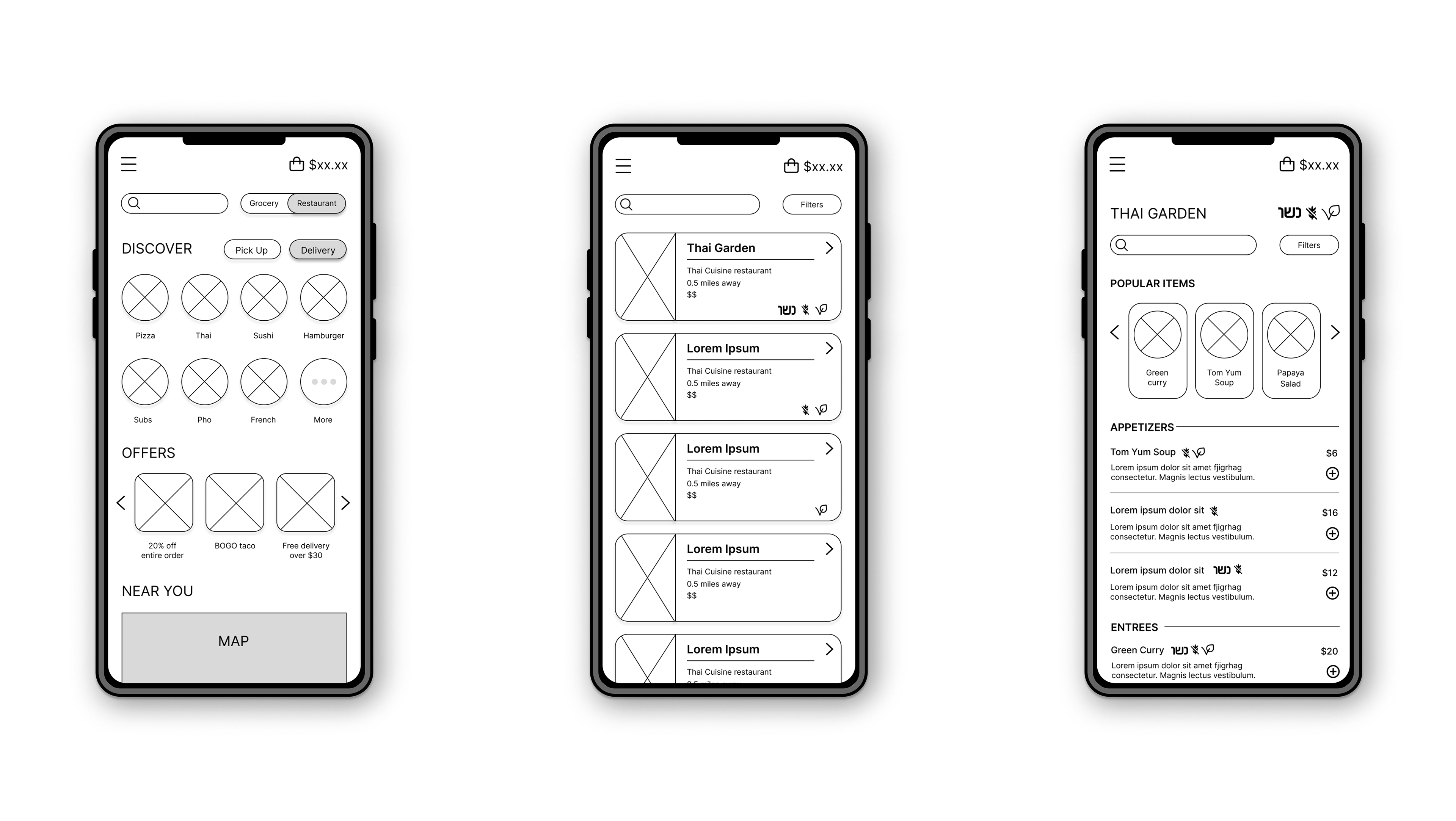
Searching for Options
Frames were created in order to show the main search sequence of users choosing a type of cuisine, proceeding to choose a restaurant and the browsing the restaurants menu. Allergens were listed for each restaurant and menu item, which was later changed for more intuitive user experience in the high-fidelity wireframes.
High-fidelity Wireframes
Logo
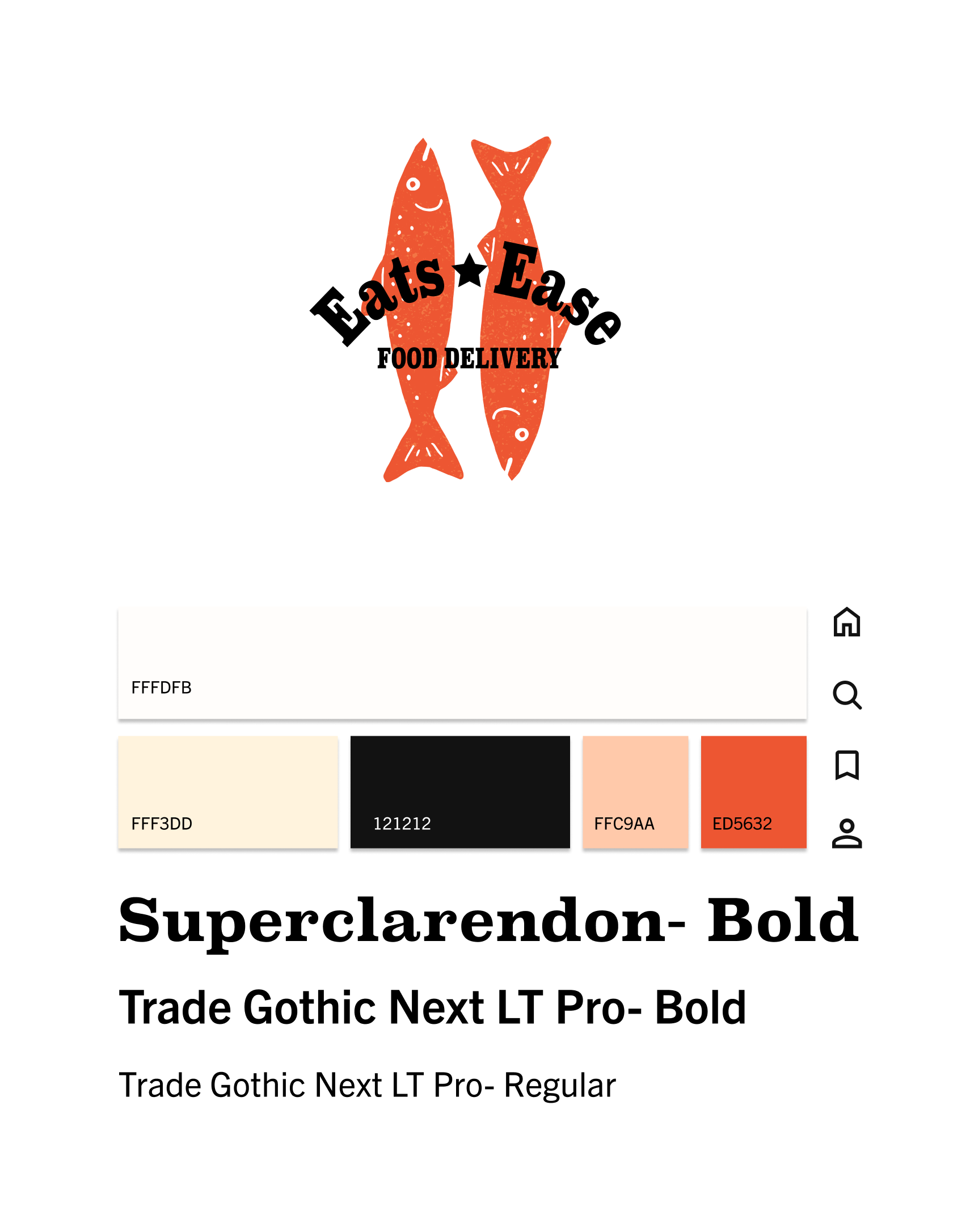
For the logo, I wanted to showcase that EatsEase would cater to those with high-end taste so I created a logo with two fish. The two fish are modeled after Branzino, a greatly loved but expensive Mediterranean sea bass. The colors and typeface link to the type and color scheme of the website, as shown below.
UI Design
For the UI, I was inspired by Arches National Park in the winter, with soft, warm neutrals and bright orange pops. For typefaces, Superclarendon was chosen as the display type, with Trade Gothic Next LT Pro implemented for all other type.
Onboarding Animation
Onboarding animation begins when user successfully creates an account, highlighting the brand logo before bringing the user to the app's home page. This animation provides positive feedback for user to show that no further action is needed to create an account on the app.
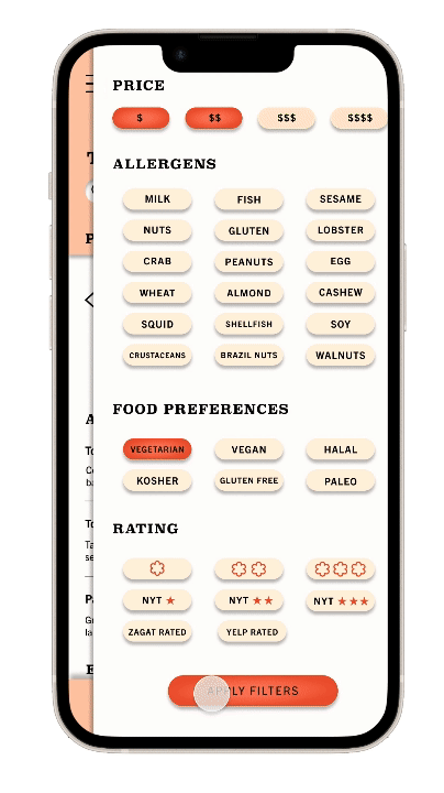
Filters
Once filters are applied, the menu updates by removing all items that do not meet criteria. Labels then appear on all menu items that do fit criteria.
Cart
When user adds item to their cart, a counter appears so user can add more items if they want. Then an animation appears around the cart to signify to the user that something has been added. After one item is added, only the cart number would change.
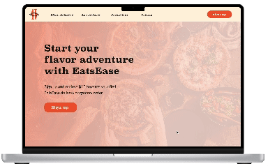
Marketing Page
The marketing page was created for desktop and aims to entice users to download the EatsEase app. The marketing page includes main features of the app, promotional coupons, and customer reviews.
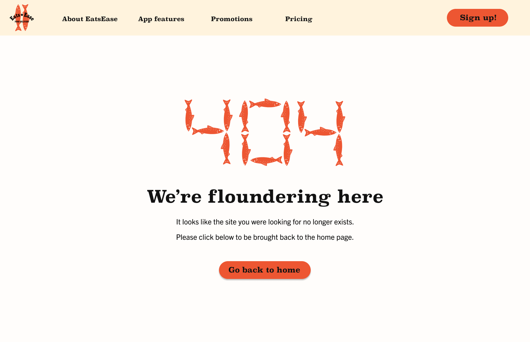
404 Error Page
The 404 error page is for the marketing page and showcases a the logo, a little joke, and link back to marketing home page.
Reflections
Moving forward with this project, I would definitely conduct a usability test on the high-fidelity wireframes to see how users navigate the site.