
Timeline:
3 weeks, October 2023
Tools:
Figma, FigJam, Optimal Workshop, Zoom
Tools:
Figma, FigJam, Optimal Workshop, Zoom
Limitations:
-Only interviews provided
-Short turnaround
Brief: I was given the task of researching and then creating an app prototype to help parents with children under 18 find the best private school for their children.
Problem: Families with children under 18 need a tool to help centralize information about private schools in their area in order to allow them to make informed decisions about choosing a private school for their child.
Goals: The goal was to help the client understand how parents decided where to send their children to school. To do so, first data had to be synthesized, then organized so that meaningful pain points and blockers could be identified. Then frames could be created, tested and then adjusted based on user's needs.
Research:
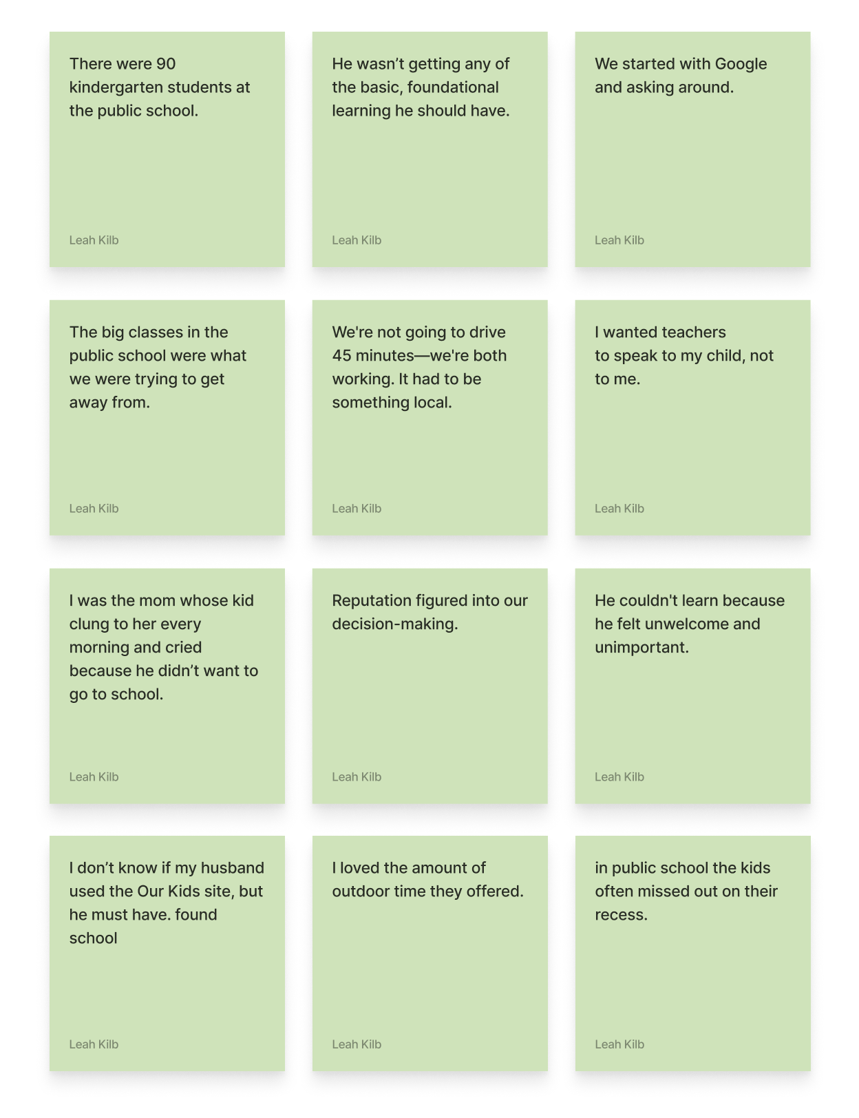
Affinity Mapping:
Research started with interviews, speaking with six parents who had recently researched and placed their child into private school after a not so great experience with the public school system. These interviews helped learn more about possible users needs and pain points. From the interviews, some key topics were mentioned multiple times by participants such as:
-school facilities or activities
-school location
-faculty and parent relationships
-How parents found their chosen private school
-public school class size
-faith-based learning
-school philosophy or curriculum
-the child’s school needs
-school location
-faculty and parent relationships
-How parents found their chosen private school
-public school class size
-faith-based learning
-school philosophy or curriculum
-the child’s school needs
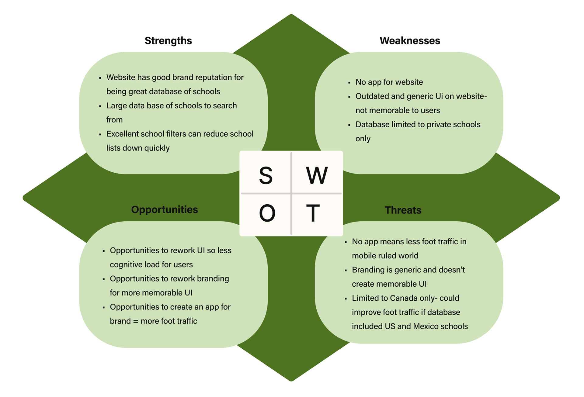
SWOT Competitive Analysis
Through the SWOT method, it was noted that competitors' strengths generally lay in their brand recognition, with one competitor, ourkids.net having excellent search filters and a large database of schools. This was not true for most competitors though, as topprivateschools.ca had a small database of schools and almost no filters. Compareschoolrankings.org had a larger database, but similarly had very little filters. All competitors lacked an app and all competitors were mostly used for research and not applying to schools.
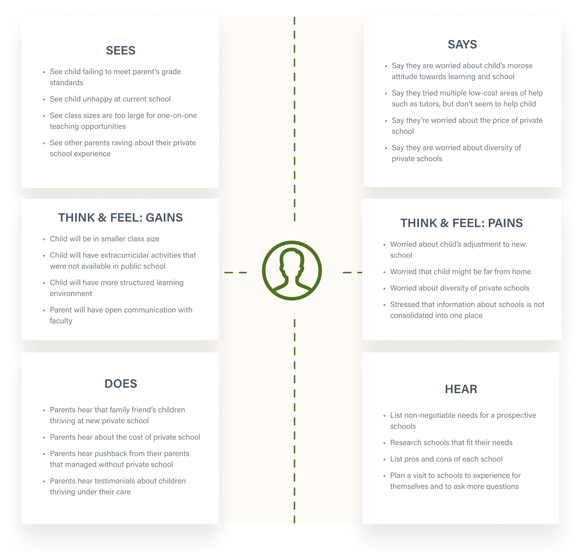
Empathy Map
An empathy map was created to further delve into possible pain points for users. Pain points were acknowledged based on how users would see, say, do, hear, think & feel about pain points and think & feel about possible gains.
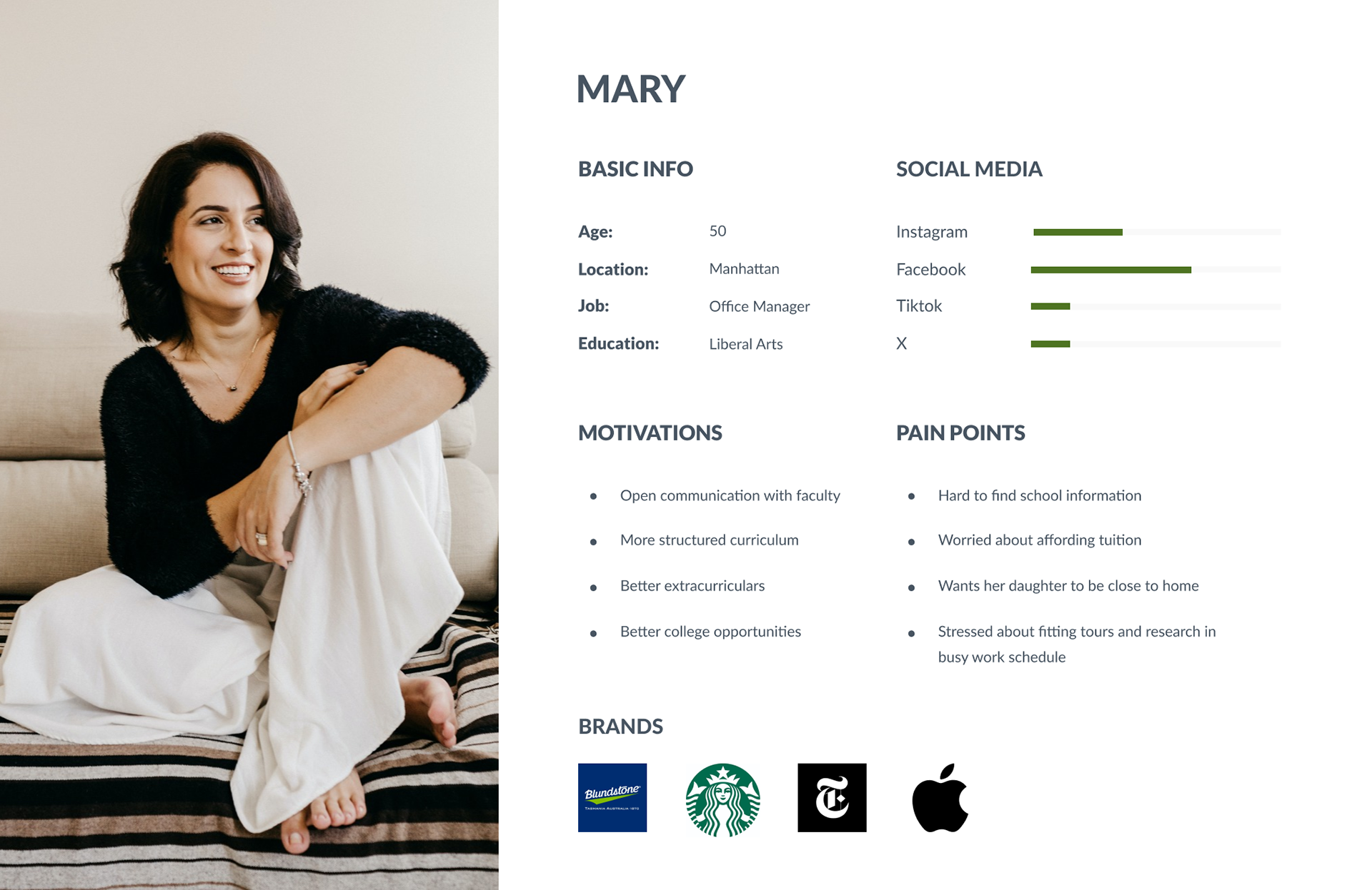
User Persona
A user persona was created in order to identify possible pain points for users, based on previous research. The user persona reads as follows:
"Mary, who lives in NYC, is an office manager and is a mother of three children. She wants to send her youngest daughter (14 years old) to a private school after her daughter has been struggling with her grades in public school. They are a middle class family and are worried about the costs of private school."
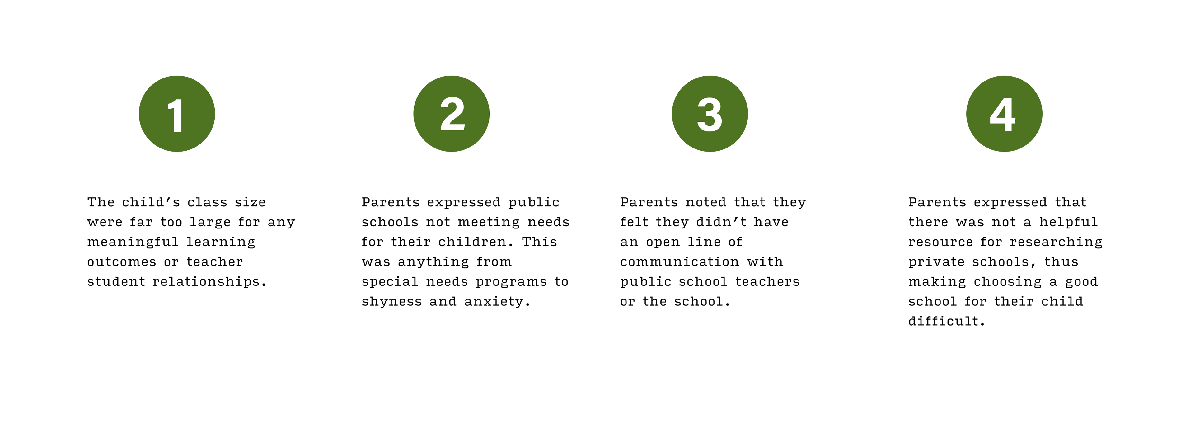
Pain Points
From the research, four major user pain points became clear.
Game plan for prototypes
Based off the research and pain points, I thought the app should move forward with the following features:

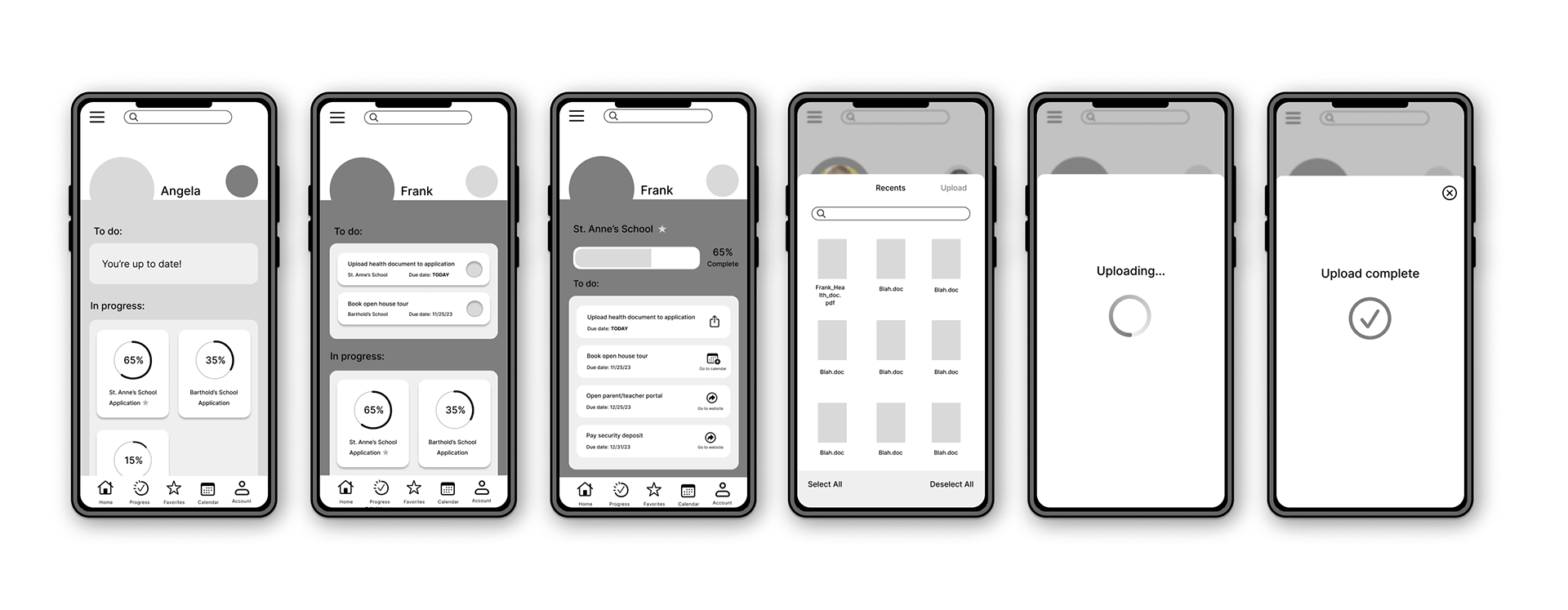
Mid-fidelity Wireframes & Testing
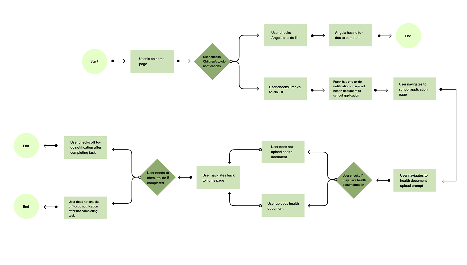
User flow chart
A usability test plan and user flow chart were created as the next steps. Both the usability test plan and the user flow chart focused on the task that would be used for user testing. The task involved participants had to complete a 'to-do' task that was due that day, which was uploading a form. After participants completed the task, they needed to navigate back to the home page to check off the 'to-do' task as completed. This task was chosen specifically because it was unclear if it would be intuitive for participants.
User Testing
Testing showed that parts of the prototype were clear while others were not.
-Both participants failed in correctly navigating from to do task to the application page. Instead of scrolling down to the application they wanted to use the task as a direct link.
-Uploading the form had a great success rate with neither participant having any issues.
-Checking off the to do task ended up being 50/50 as one correctly navigated while the other failed. It was suggested that it would be better if it automatically updated instead of needing to be manually checked off.
-A participant noted that the progress tab in the global nav seemed redundant.
-Both participants did note they found the app to not be overwhelming and was very cleanly designed.

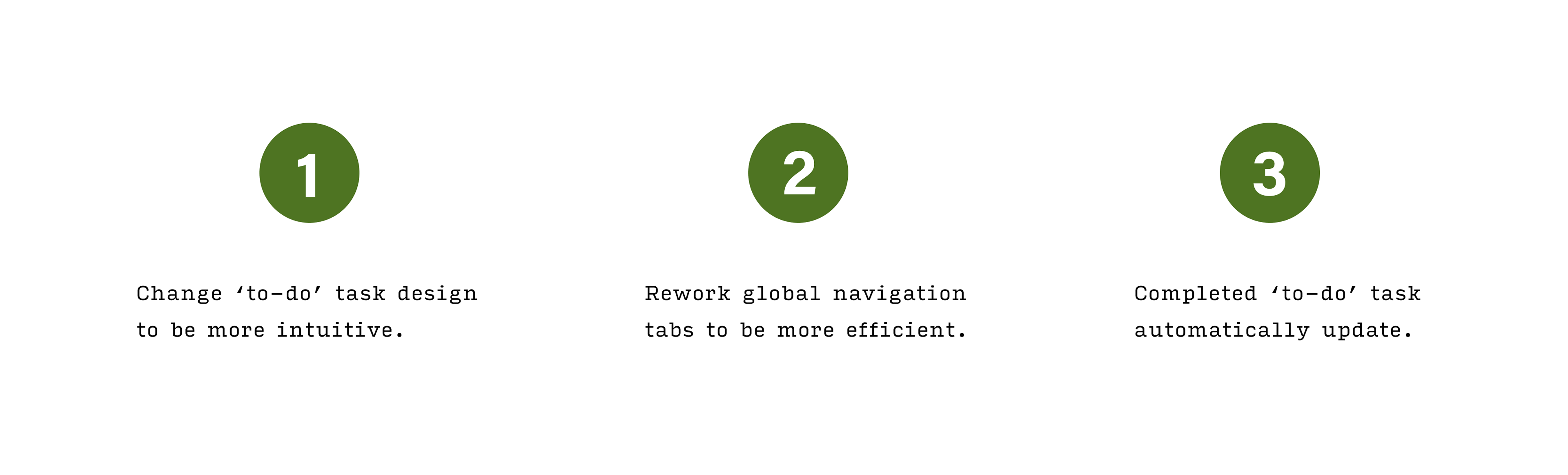
Changes for high-fidelity
Based on user testing, it became clear that there were areas that needed to be readjusted to meet user needs better.
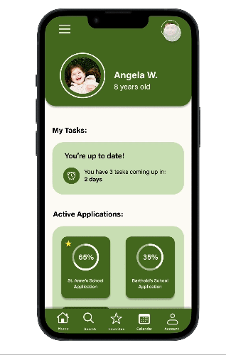
High-fidelity Wireframes
UI Design
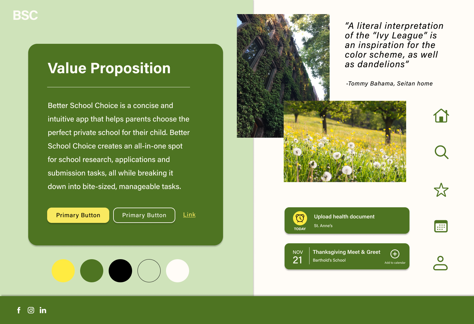
For the UI, I was inspired by the term ivy league a bit literally, particularly this picture on the right of the ivy covered windows. Because of this i chose warm greens and neutrals in hopes it would create a warm comforting and inviting experience for users who might be stressed with the task of researching and applying for schools. I did use a punchy yellow as the CTA color to stand out from the rest of the colors. I also chose the versatile typeface Acumin pro in order to keep the app less busy with just one typeface.
High-fidelity Wireframes
As noted in my recommendations, changes were made from the mid-fidelity wireframes to the prototypes. The 'to-do' task for the high-fidelity wireframes was redesigned into a direct link to the application. The 'to-do' task also automatically updates instead of being manually checked off. Lastly the global navigation was updated to have a search tab instead of progress tab.
Reflections
Moving forward with this project, I think I could create a more inventive UI experience for users as I think it is simple and usable but still a little plain. I would also move forward with more mid-fidelity wireframes, user testing and so on for other key features so that this app could be fleshed out more. All in all it was a fun project because I was involved from starting UX research to finishing the hi-fi prototypes after testing. I learned a lot from this project!